Nat Geo Kids // Rebrand

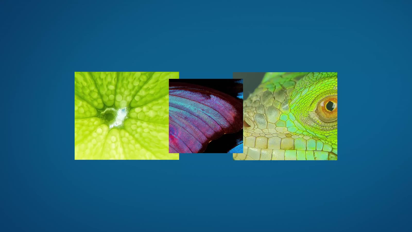
Igniting curiosity in a new generation of explorers
Igniting curiosity in a new
generation of explorers
We partnered with National Geographic Kids to reimagine the brand that invites kids to discover the wonders of our planet. MAkinĖ led the project from end to end: concept, design, animation, editorial, key art, OOH and retail, delivering an integrated campaign across broadcast and social.
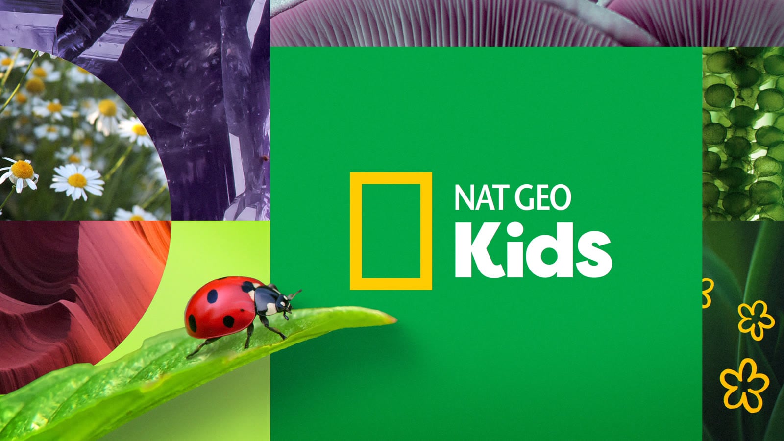
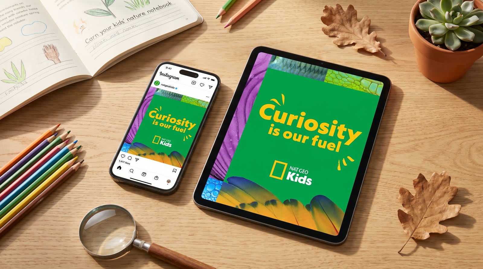
Anchored by the iconic yellow border, the new identity pairs real Nat Geo photography with hand-drawn doodles and a vivid palette of greens, blues and purples. The result is a modular system that feels scientifically grounded and playfully kid-sized at the same time, built to scale across every screen and shelf.
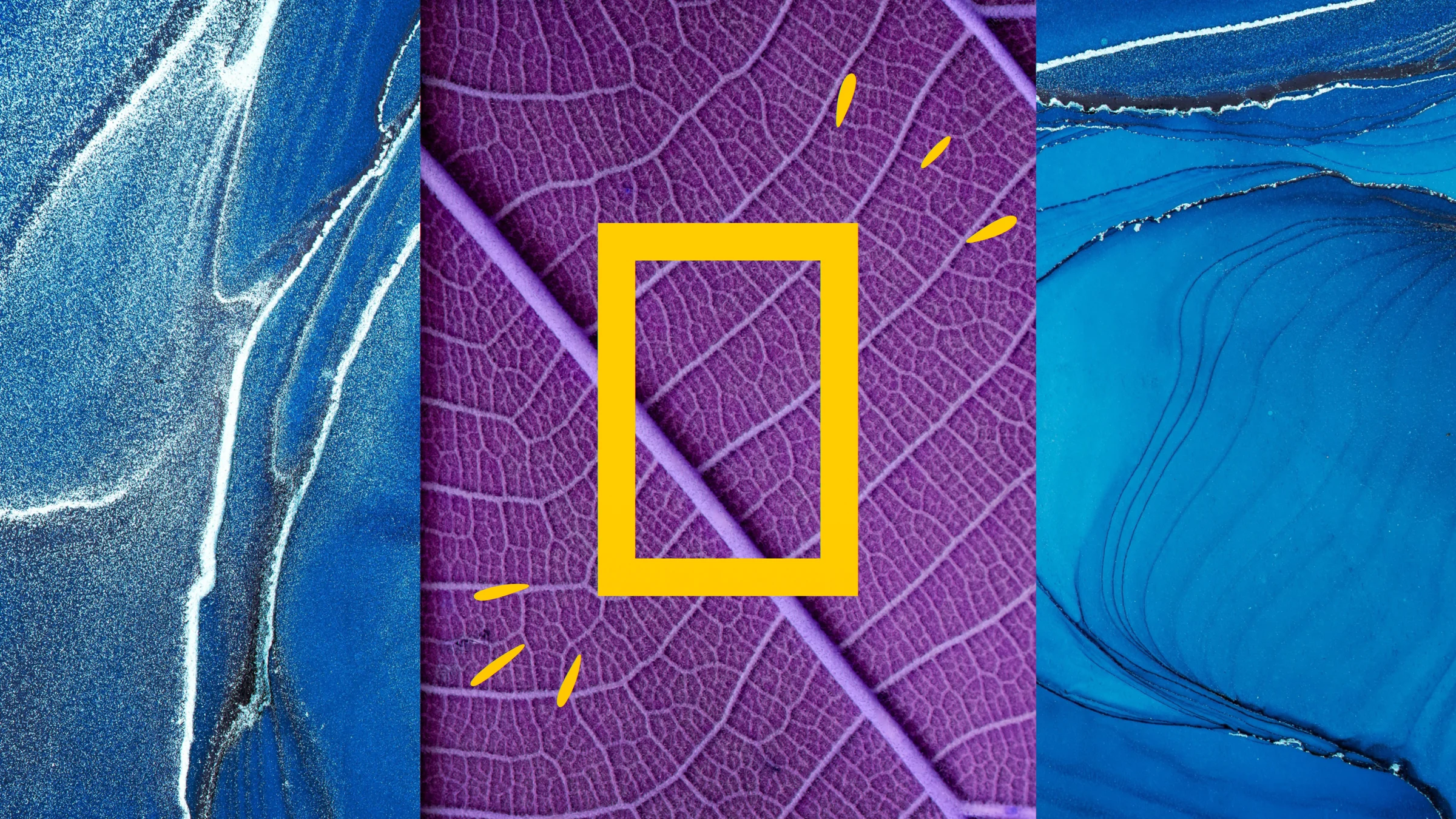
A Window to the Natural World
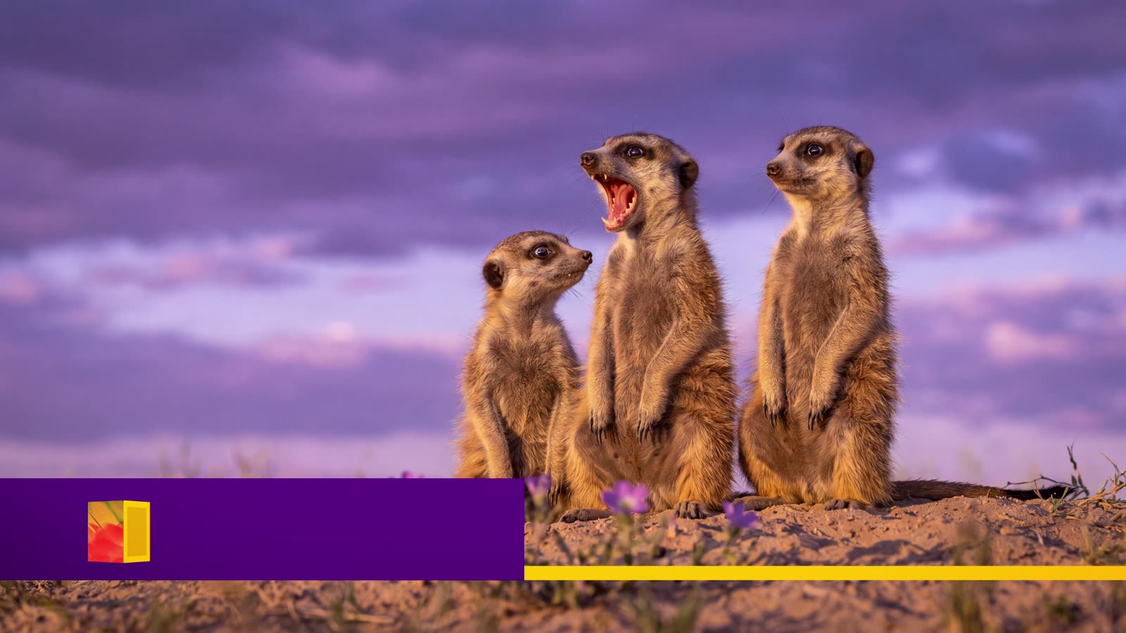
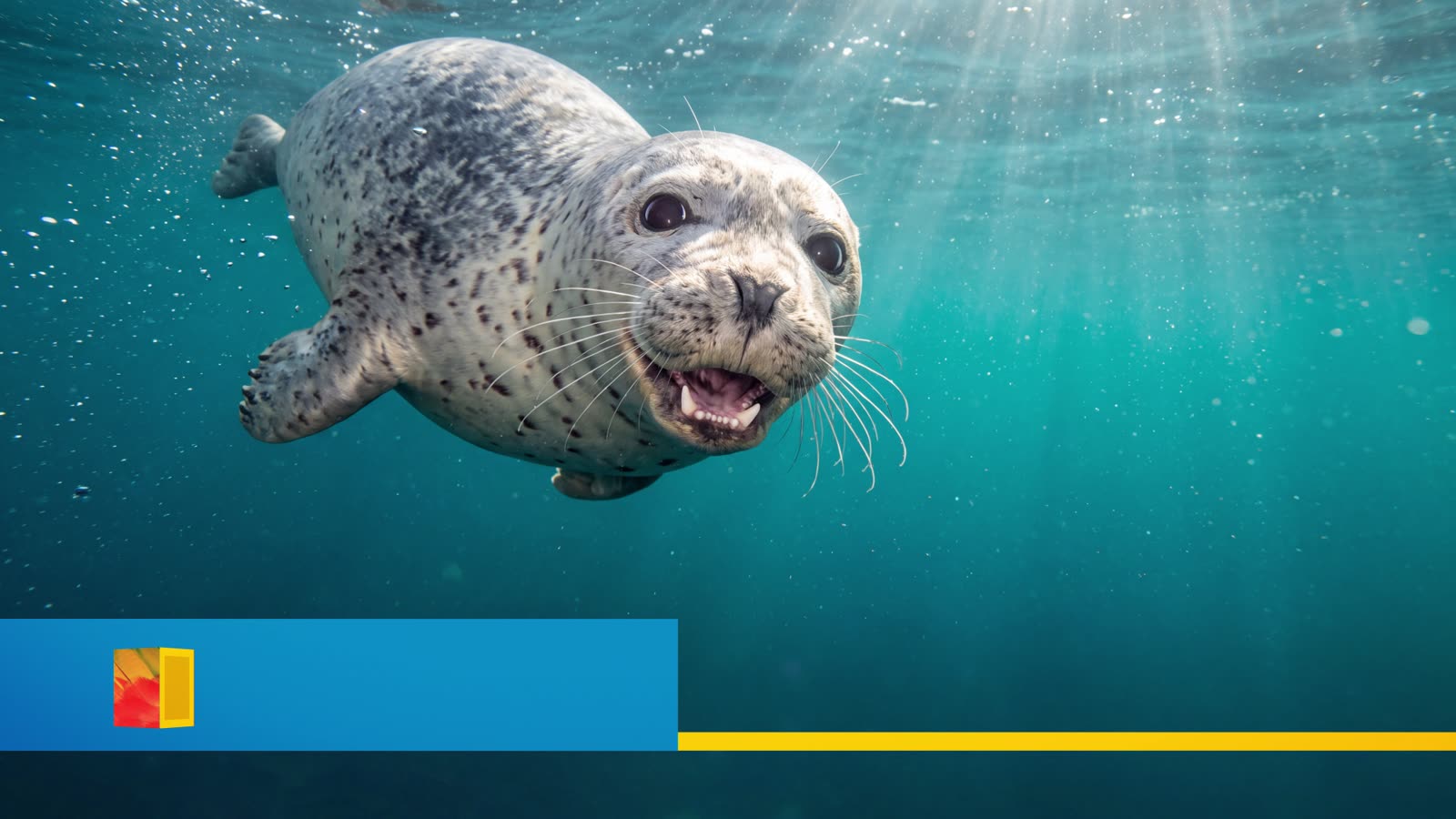
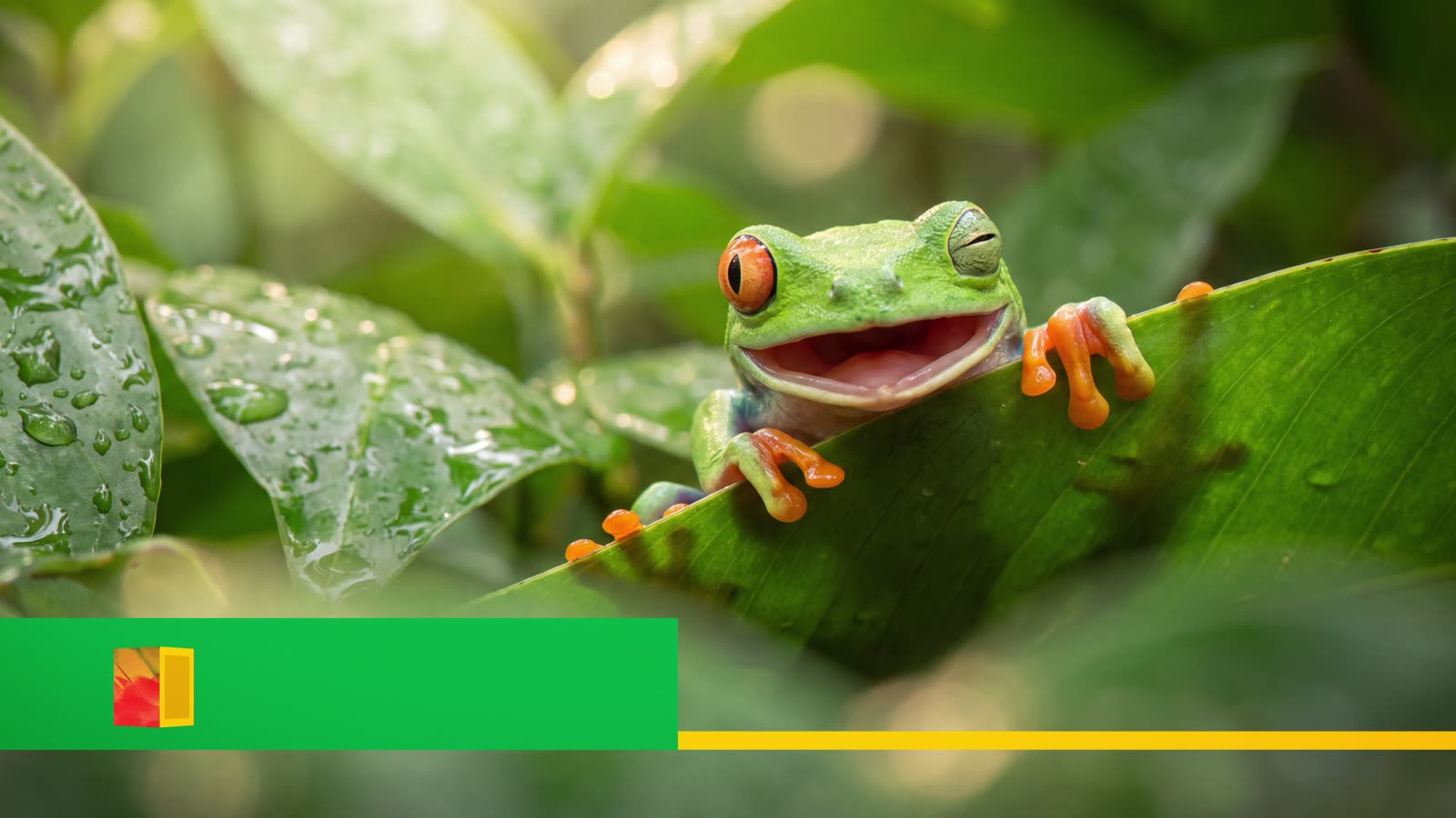
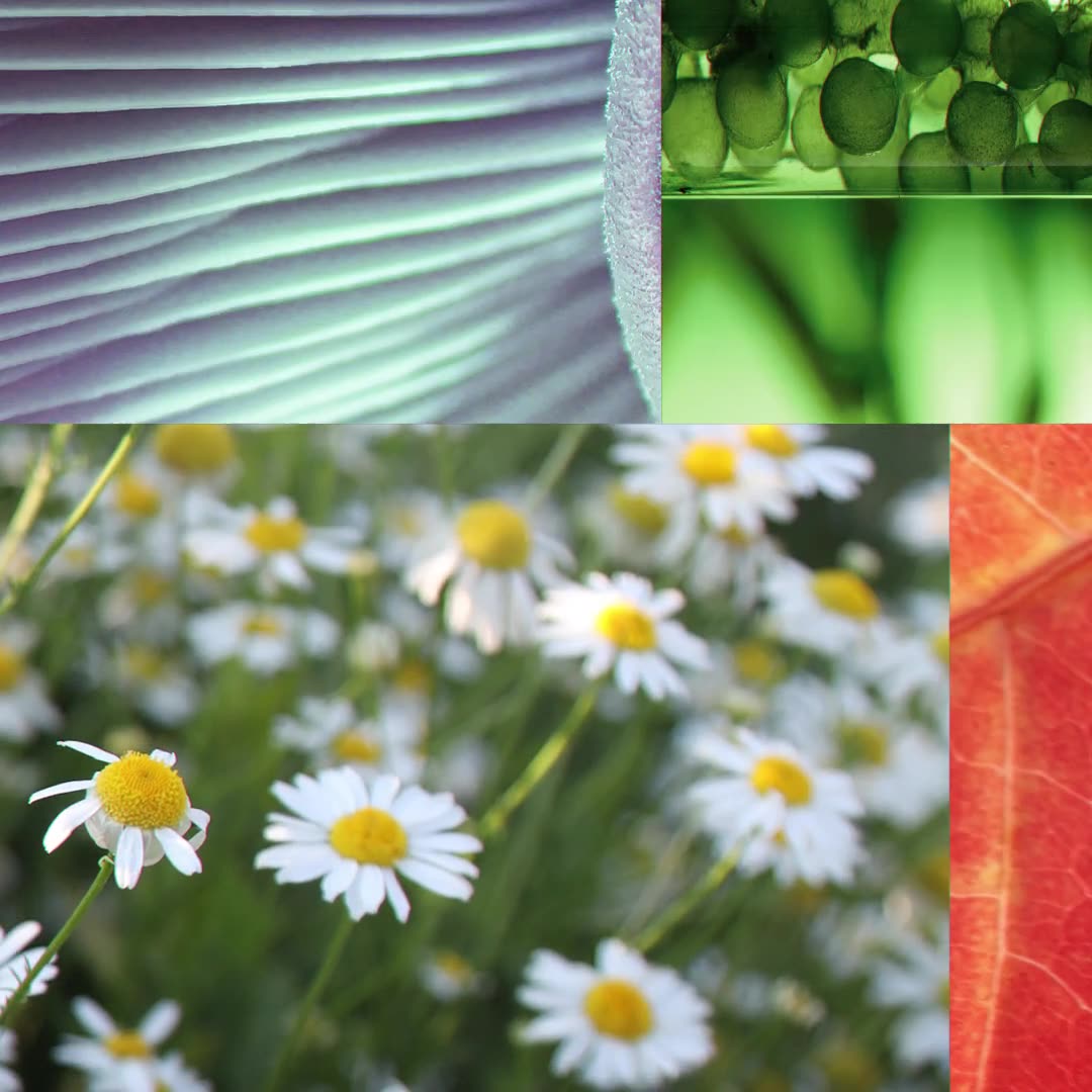
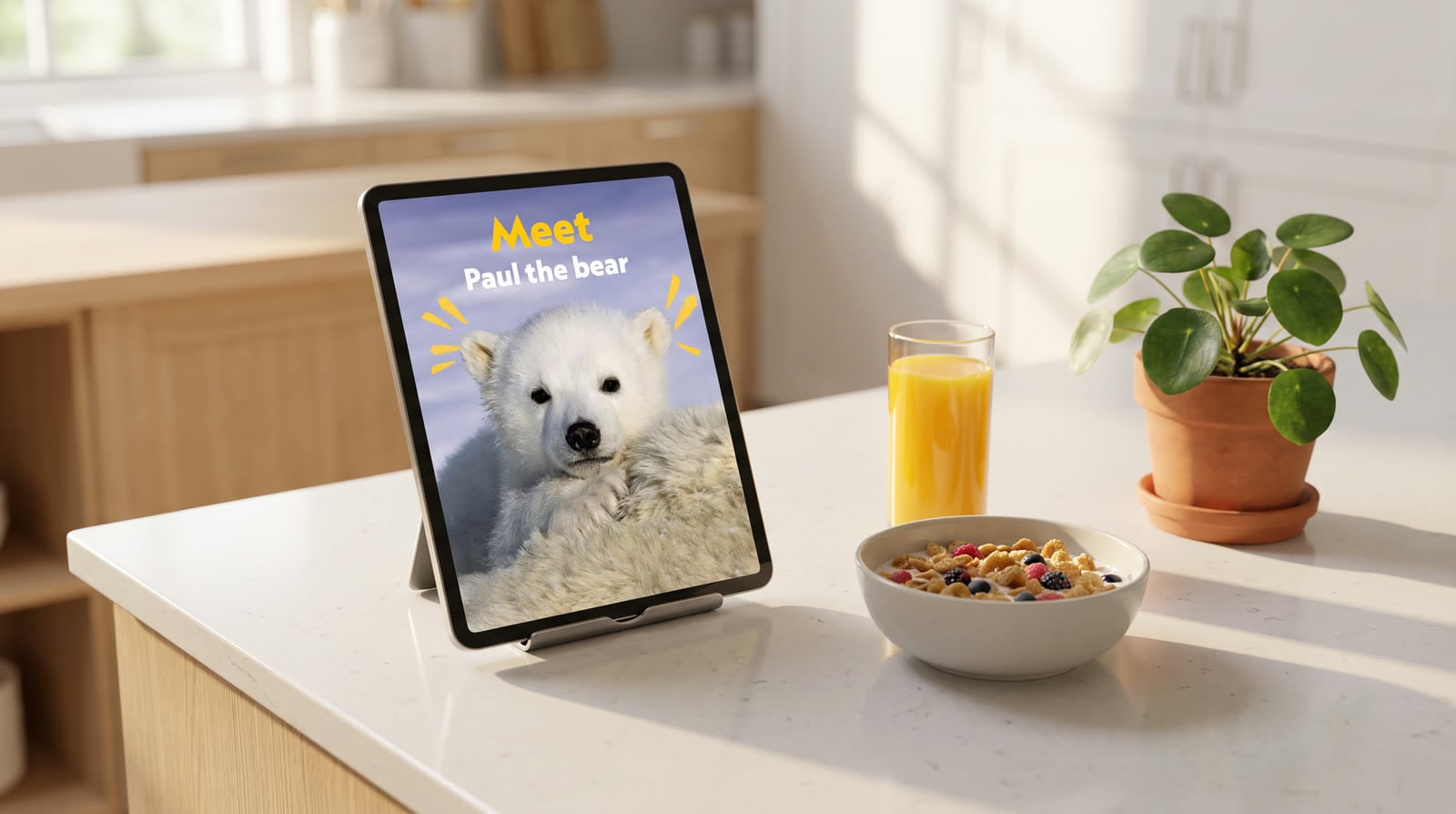
We turned the yellow border into a window. It frames, crops and reveals Nat Geo's photography, while bold type, color blocks and doodles layer on top to create a playful, ever-changing expression of the brand.
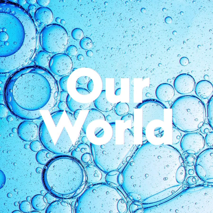
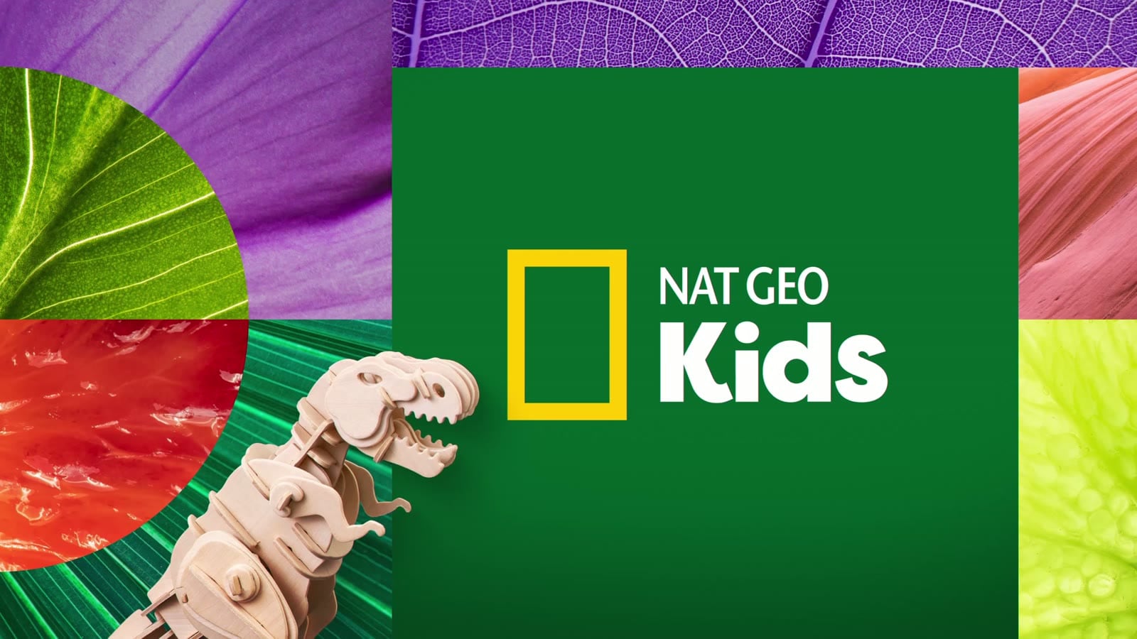
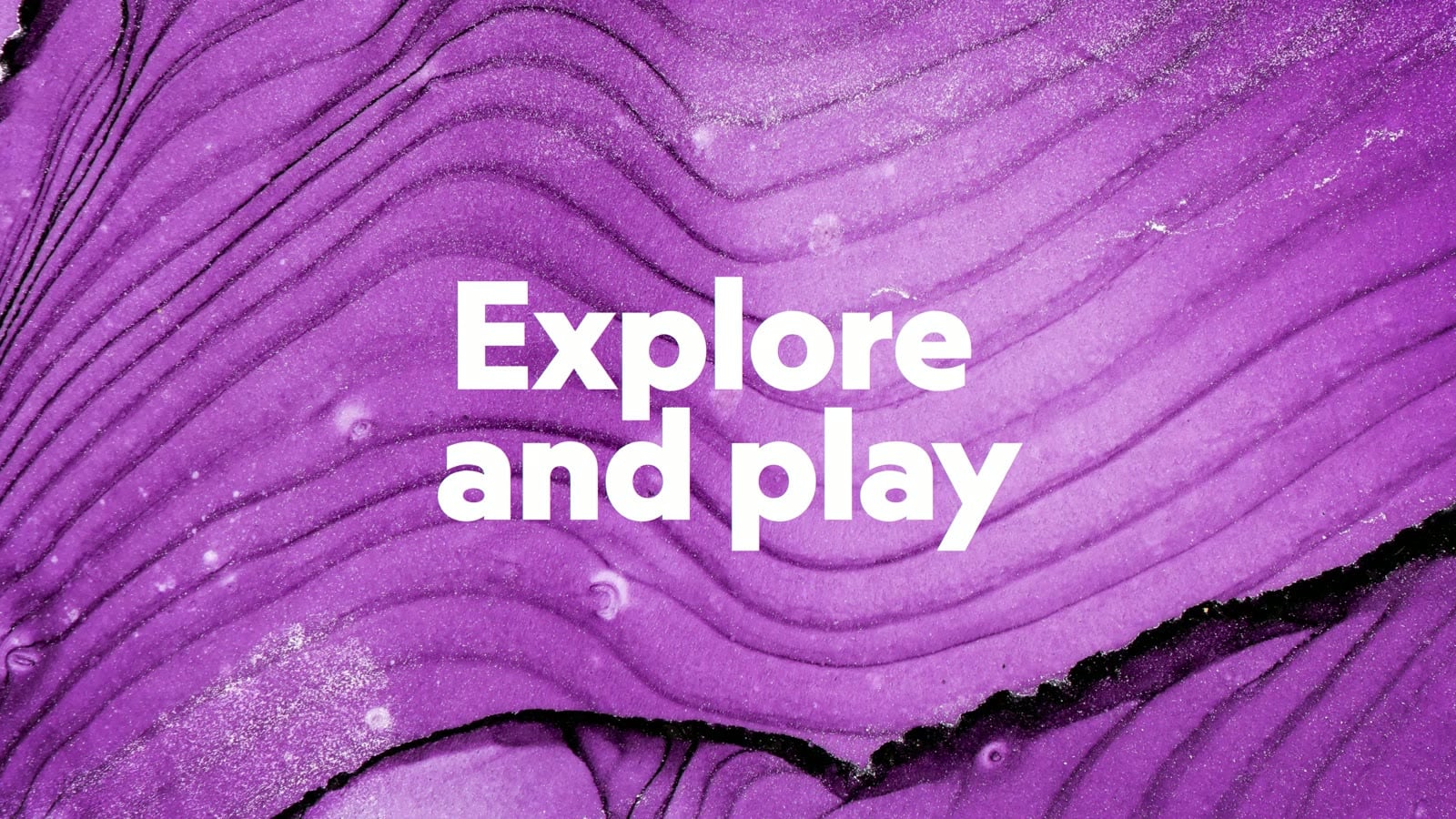
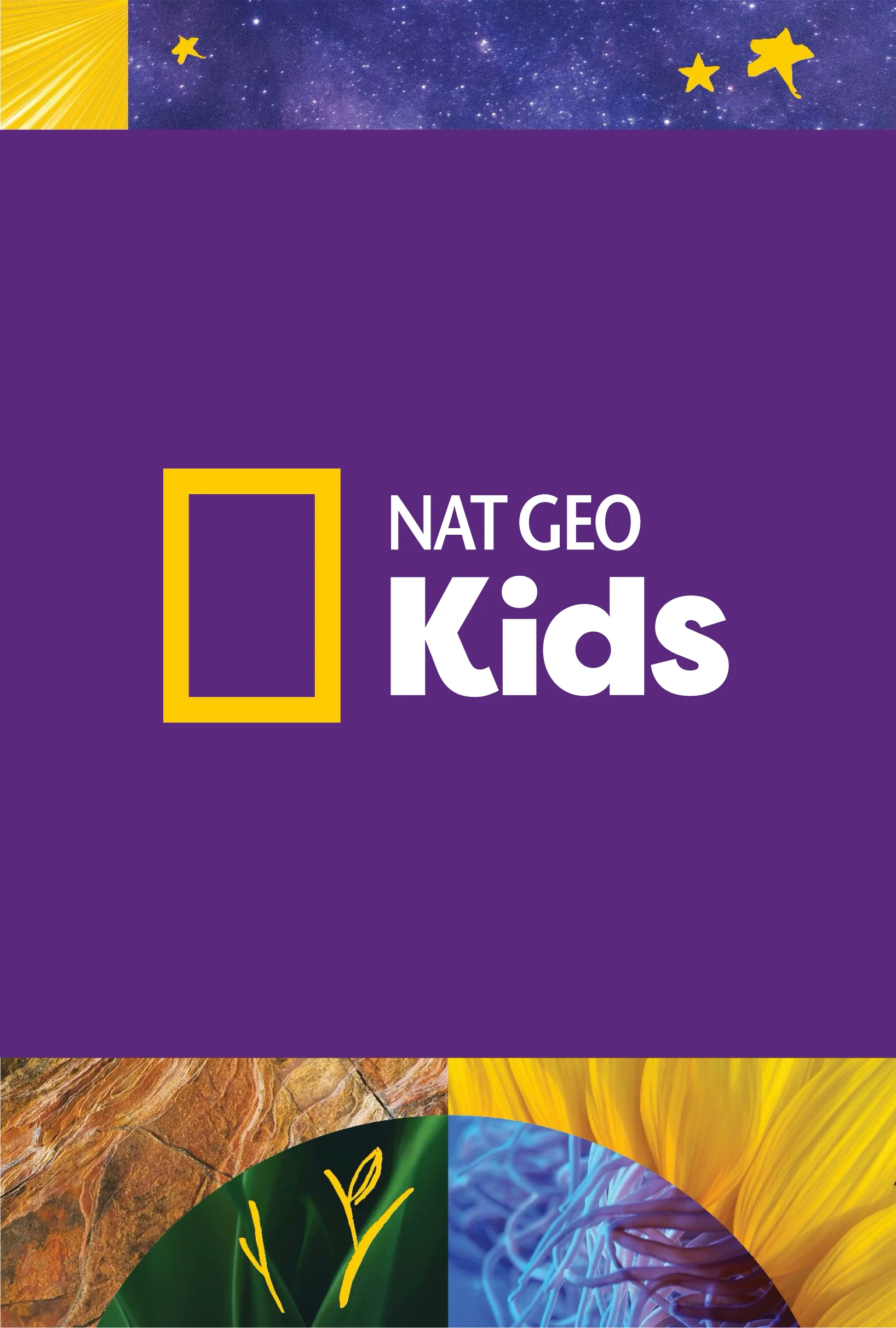
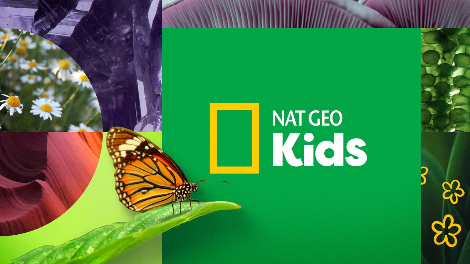
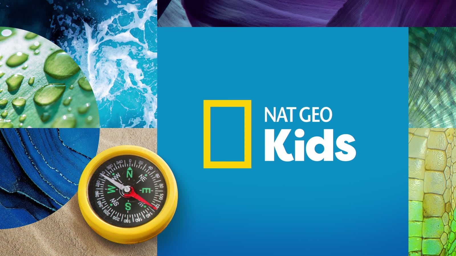
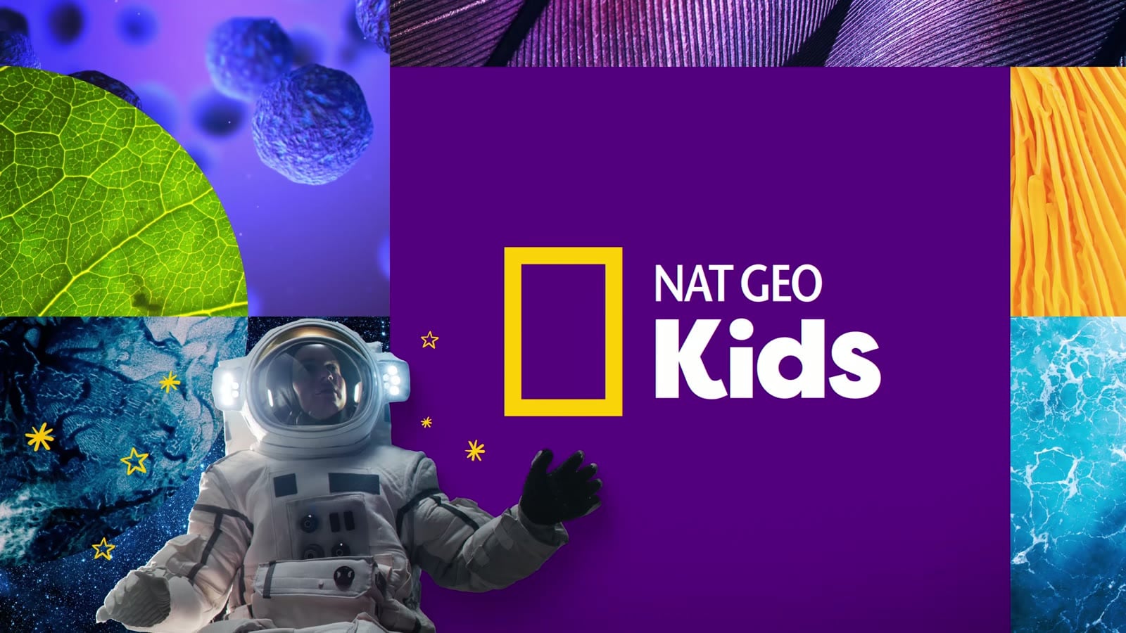
Broadcast Promo Toolkit
We designed, animated and edited a complete on-air package: opens, IDs, closes, end pages, text cards and lower thirds. The yellow border becomes a window into the natural world, framing and revealing photography as it moves. In the closes, rotoscoped animals, an astronaut and a dinosaur break out of the frame, a simple idea that captures what Nat Geo Kids promises: curiosity that can't be contained.
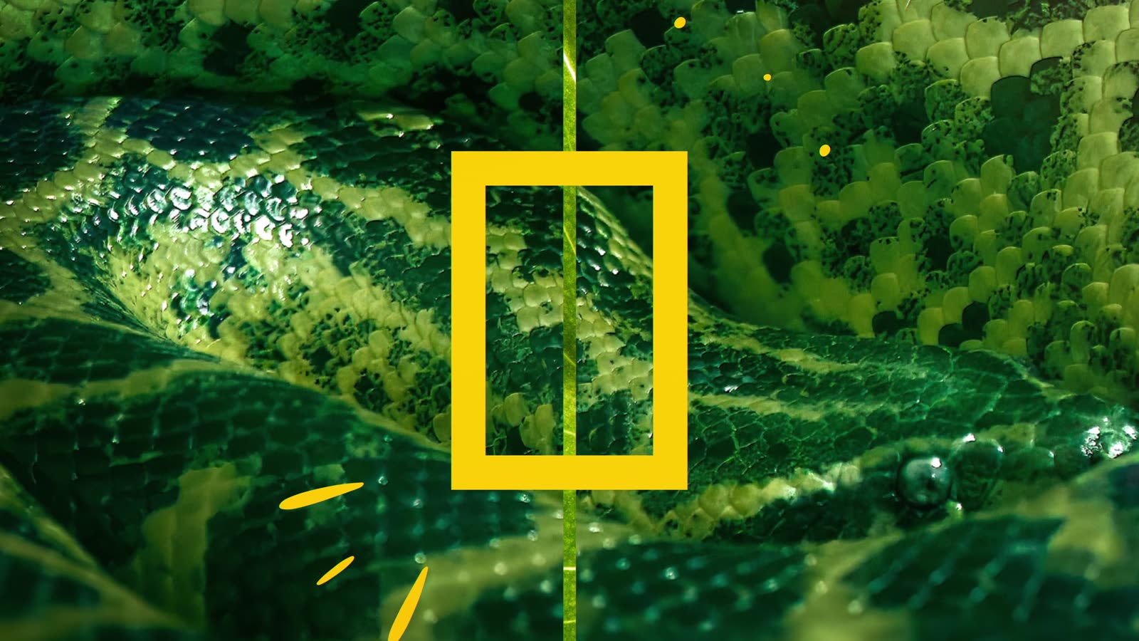


Color & Typography
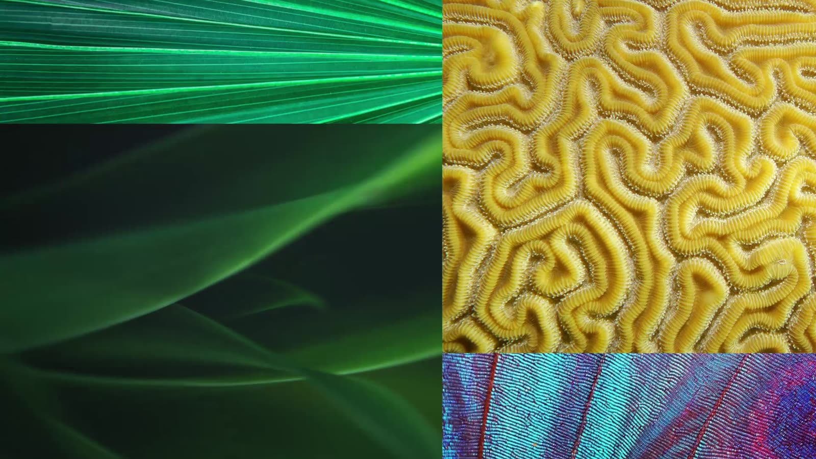
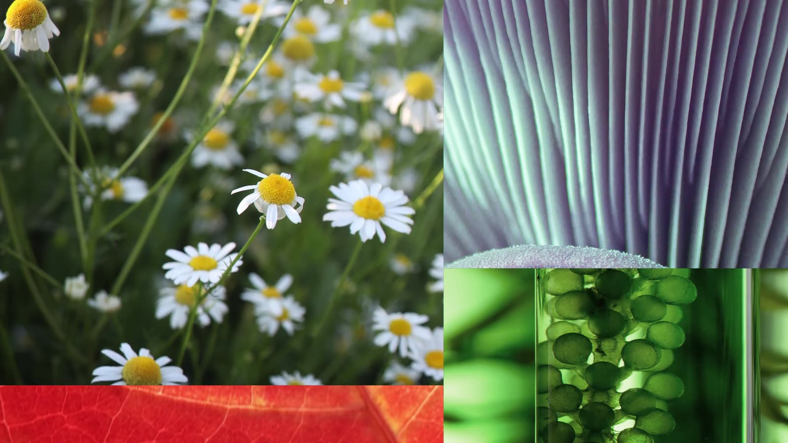
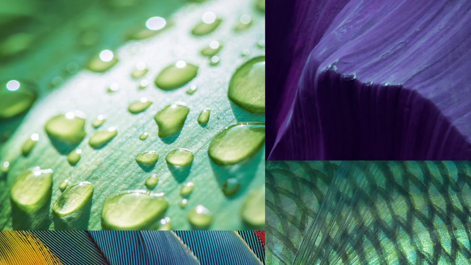
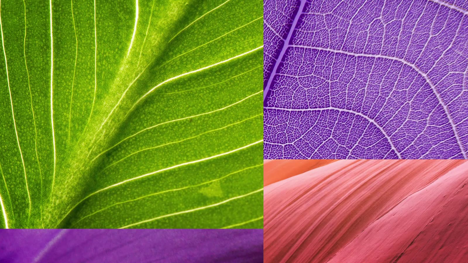
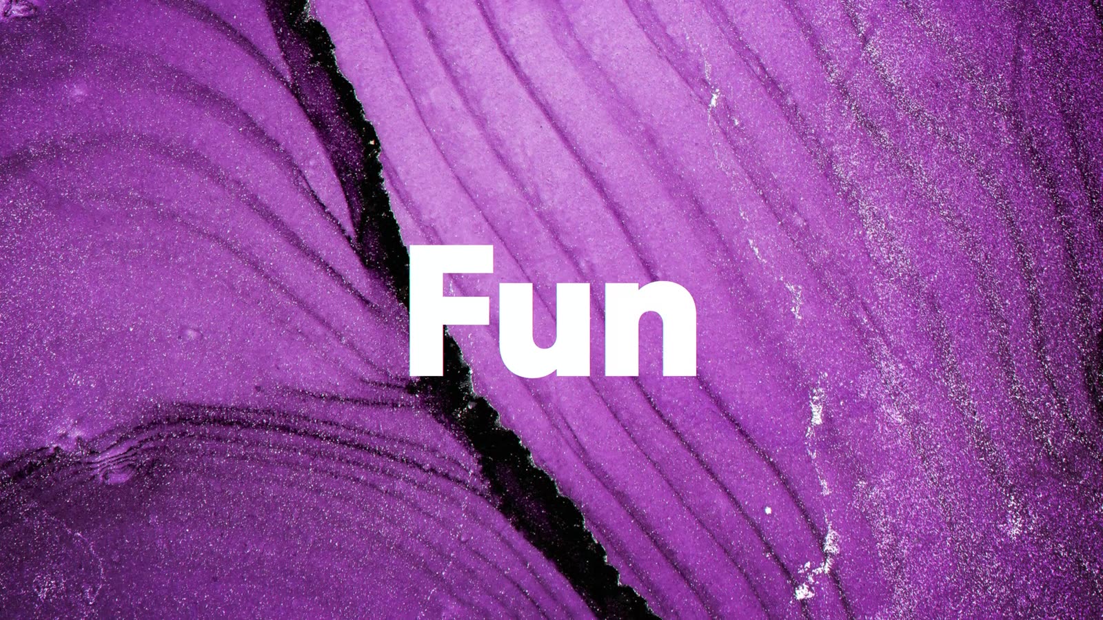
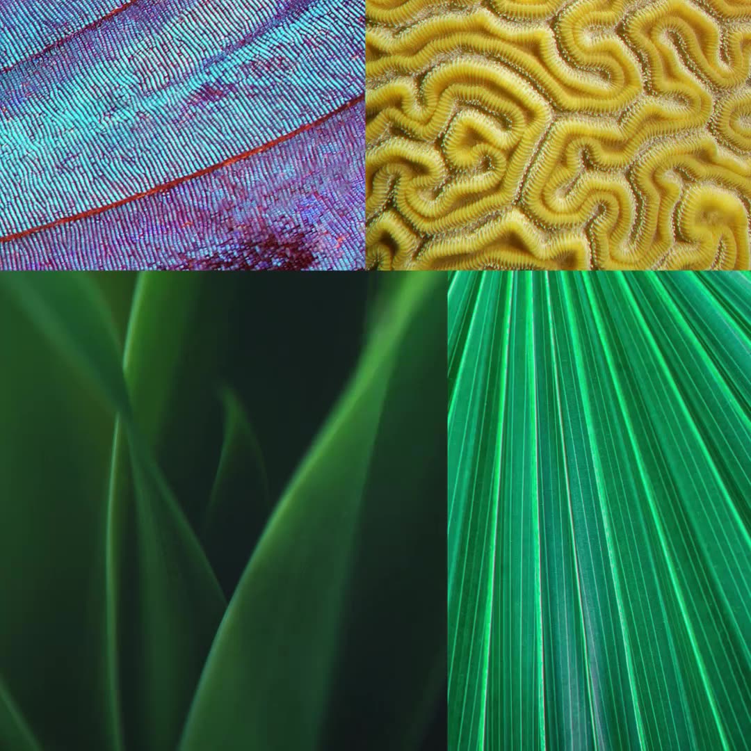
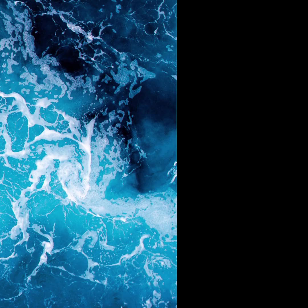
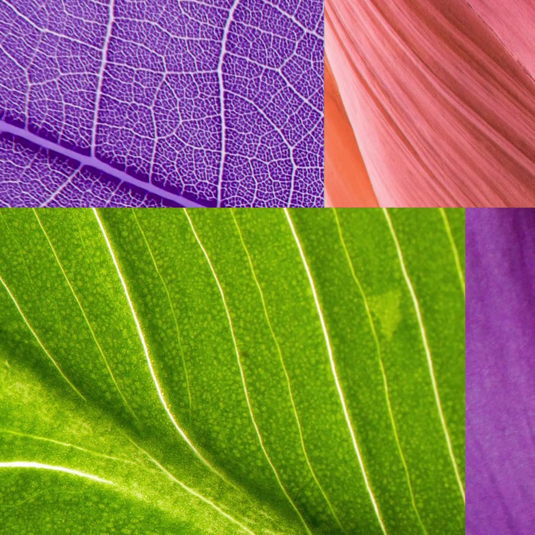
The palette is drawn straight from nature: forest and leaf greens, ocean blues, and deep purples taken from flowers, feathers and the night sky. Signature Yellow ties everything back to the parent brand. Geograph Black carries the headlines with confidence, while Puffin Display Soft brings a rounded, friendly voice made for young readers.

Doodles
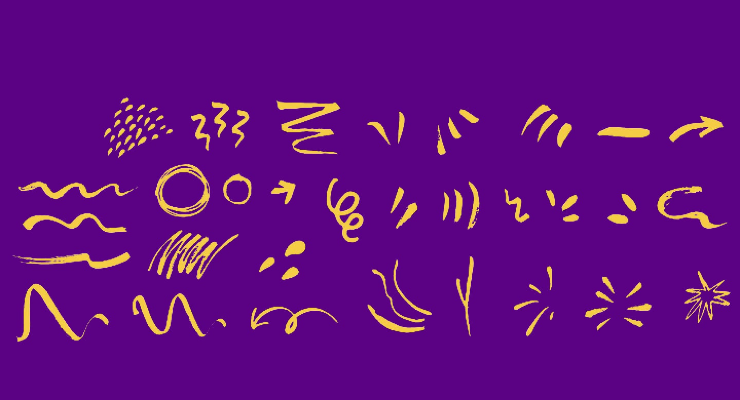
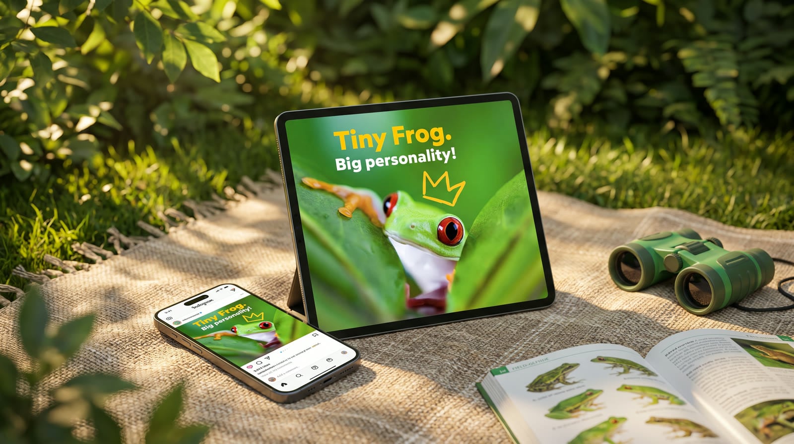
A hand-drawn layer brings energy and personality to the brand. Always applied in Signature Yellow, the doodles work in two sets: icons and pictograms (compasses, rockets, ladybugs, leaves) that reinforce meaning and complement photography, and accent marks that add emotion and movement to headlines and imagery.

Nature as a Color System
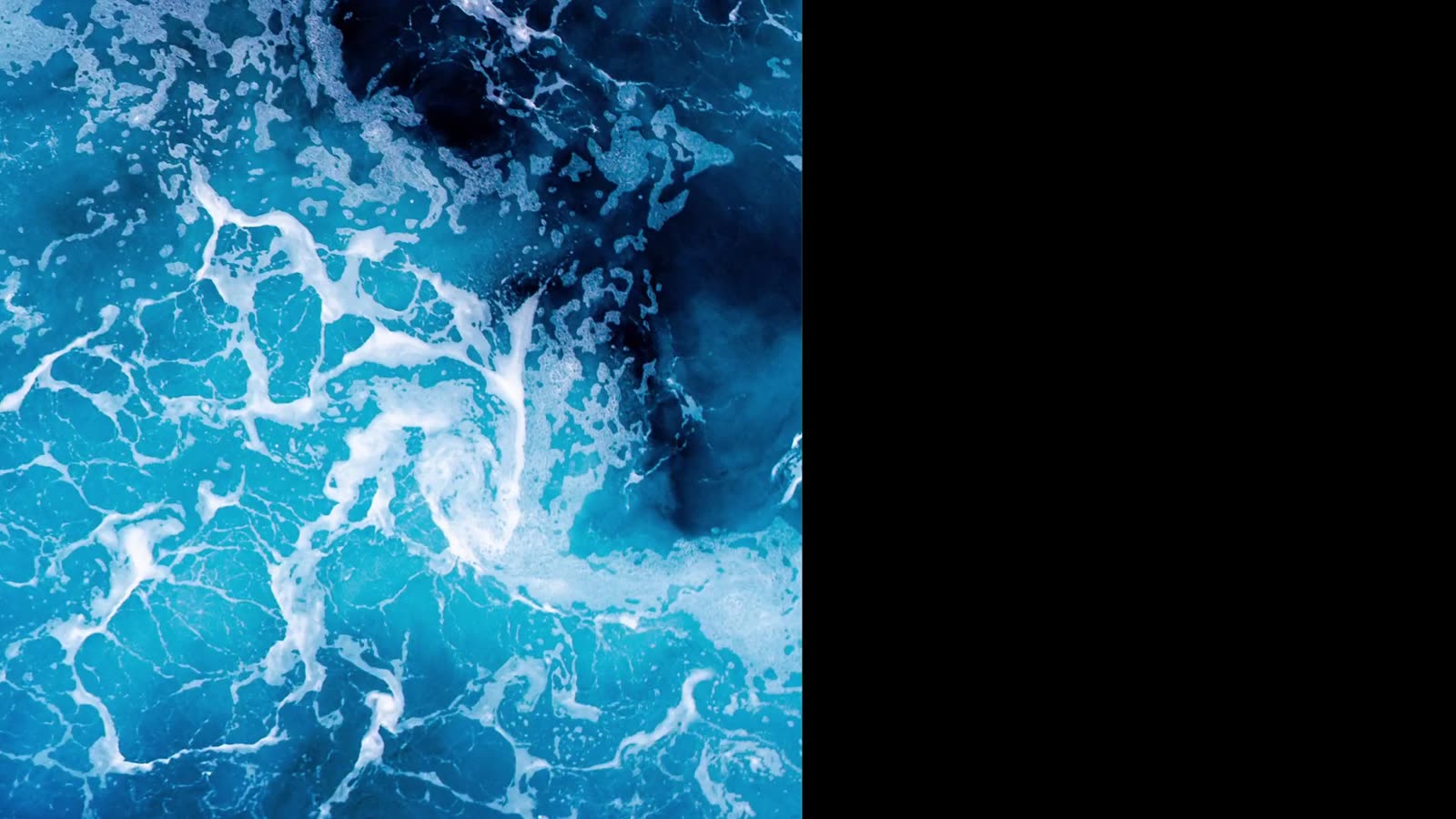
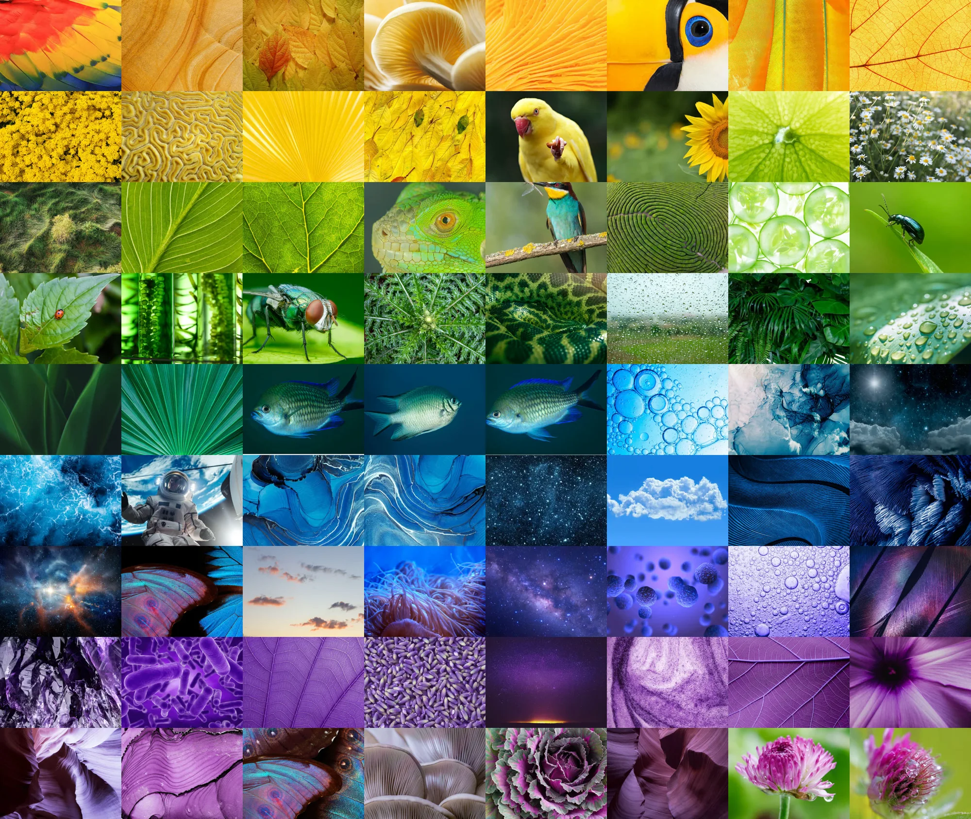
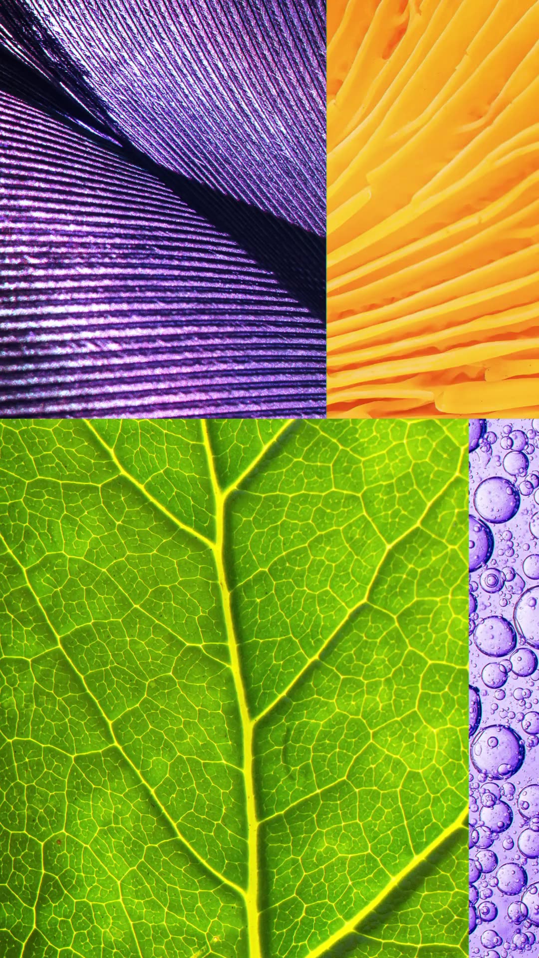
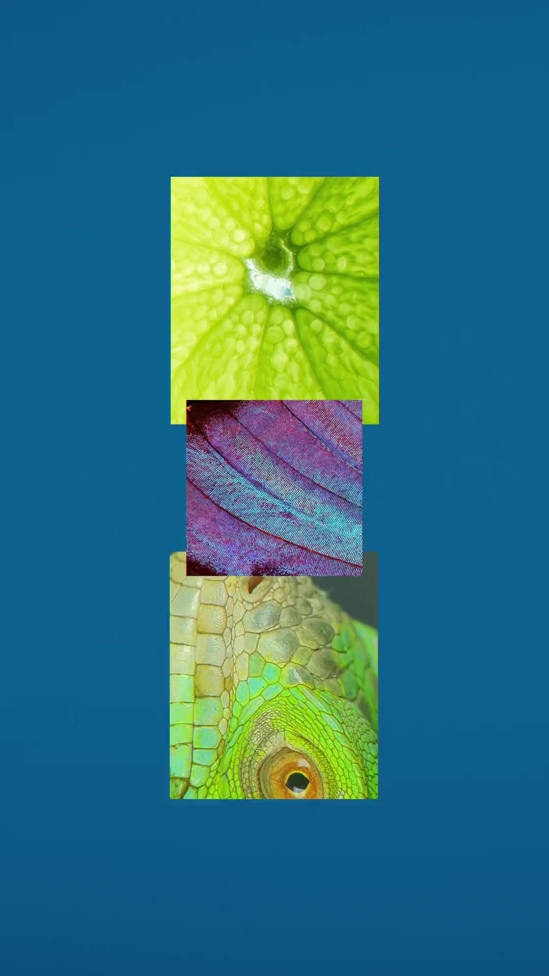
Every brand color is backed by a library of macro photography from the natural world: pollen and sunflowers for yellow, ferns and frogs for green, coral reefs and water for blue, petals and feathers for purple. These photographic textures turn the palette into something kids can almost touch, and connect every flat graphic back to Nat Geo's photographic heritage.
Built for Every Screen
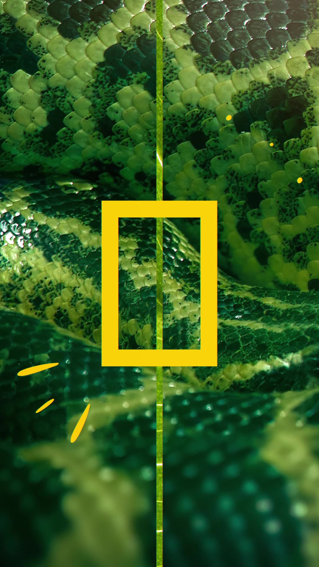
Every animated piece was designed and versioned natively for 16x9 in 4K, 1x1 and 9x16, so the brand moves just as well on TV as it does in a vertical feed.
Social Media System
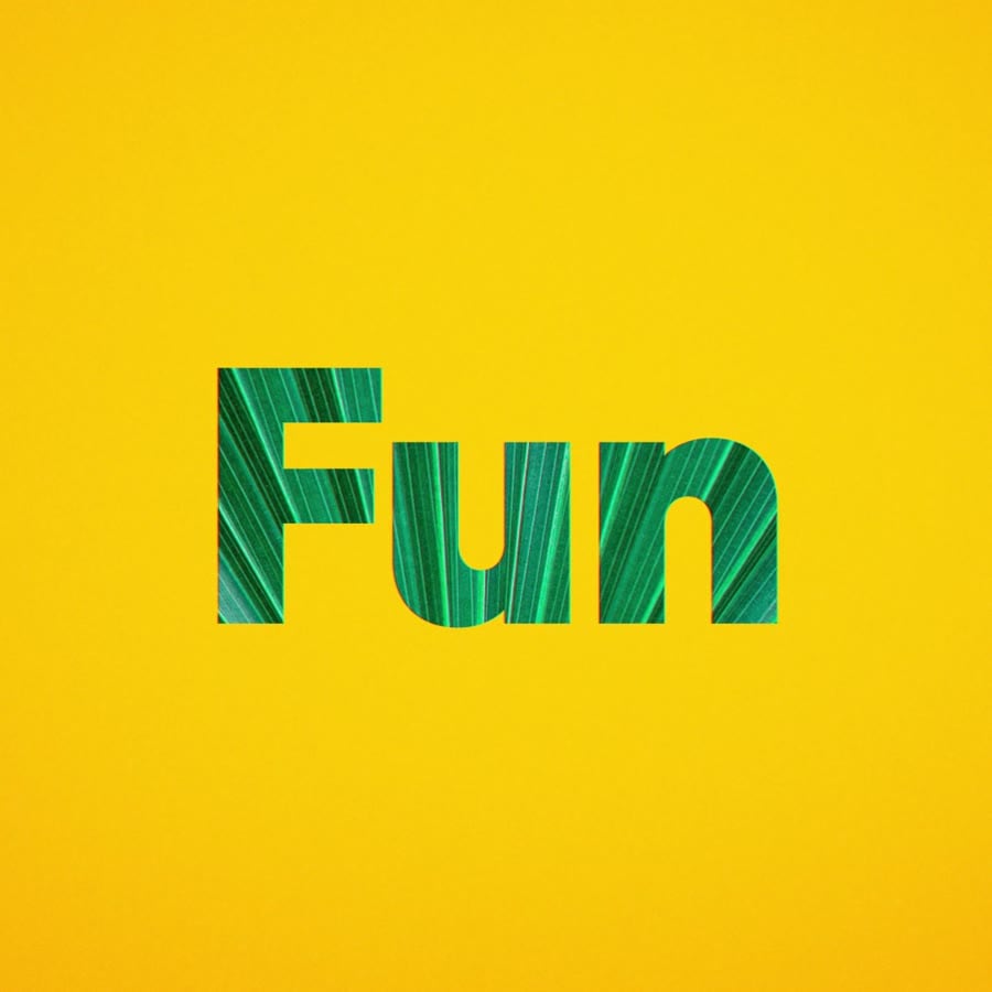
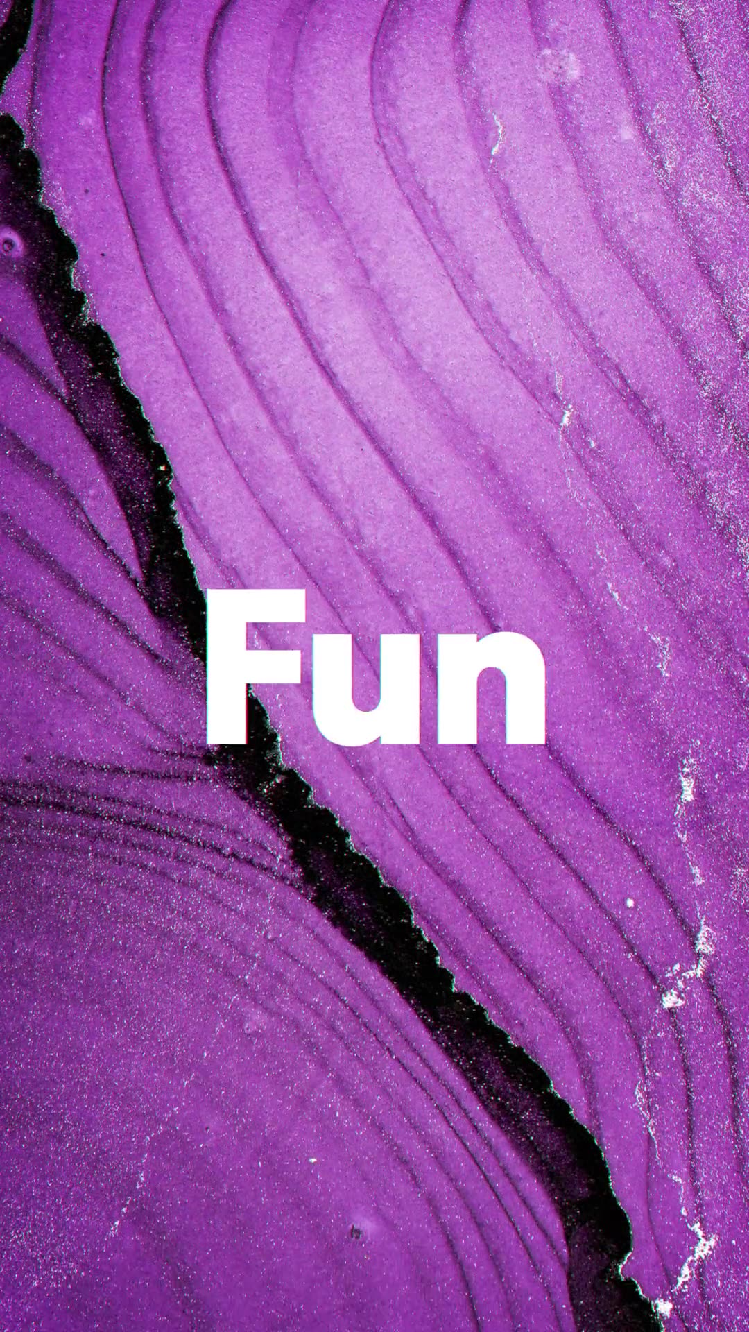
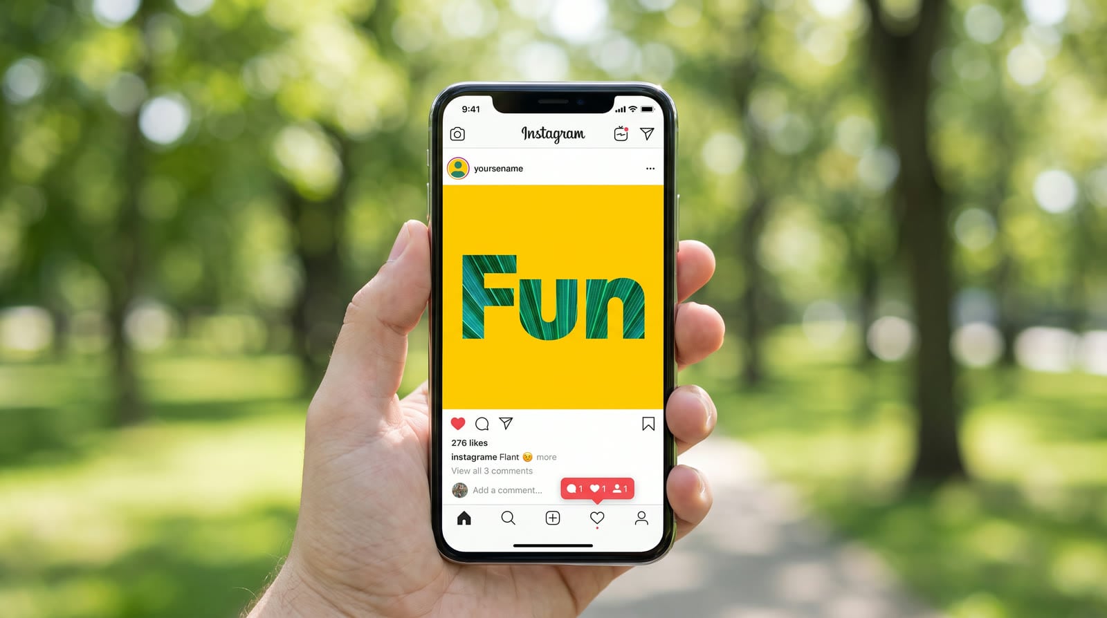
For social we built a toolkit of modular templates that lets the Nat Geo Kids team publish quickly without losing the brand's voice: Facebook banners, profile avatars, bold yellow word cards, three families of text cards, magazine subscription posts and photographic posts. Each is versioned in 4x5, 1x1 and 9x16, mixing solid color, photographic textures and doodles in endless combinations.

Nat Geo Kids YouTube Channel
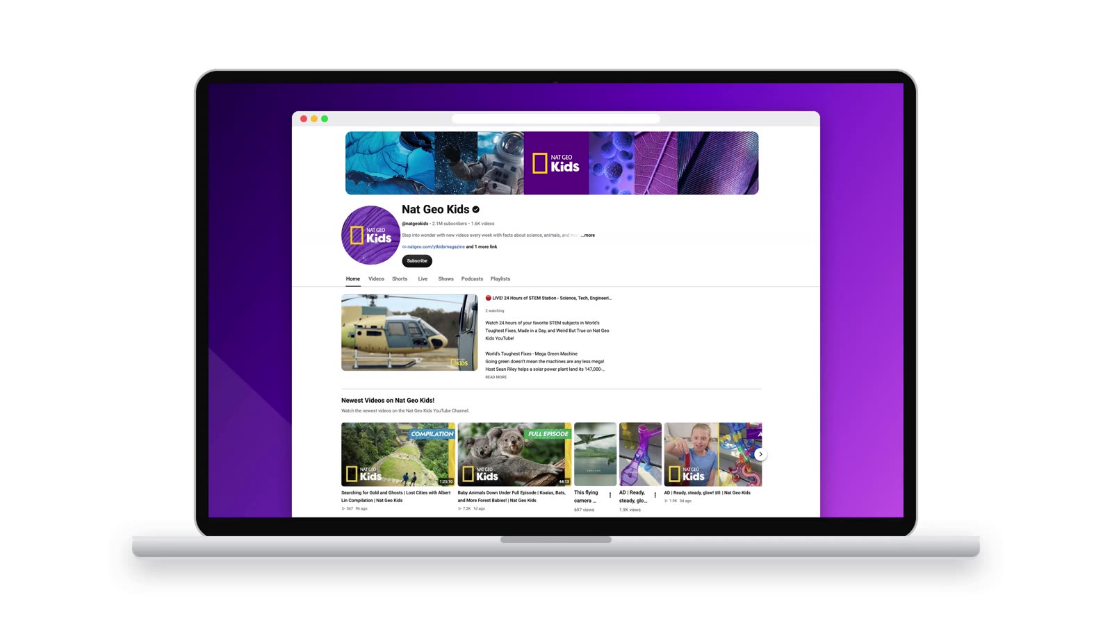
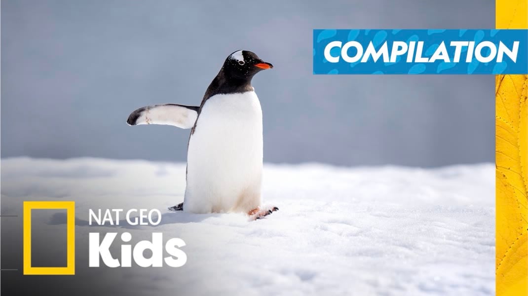
MAkinĖ also designed the full YouTube toolkit: channel headers in green, blue and purple, a flexible thumbnail system with color-coded descriptor bars (Compilation, Trailer, Live Stream, Podcast, Original Series) and an animated end page that keeps young viewers watching.


Key Art, OOH & Retail
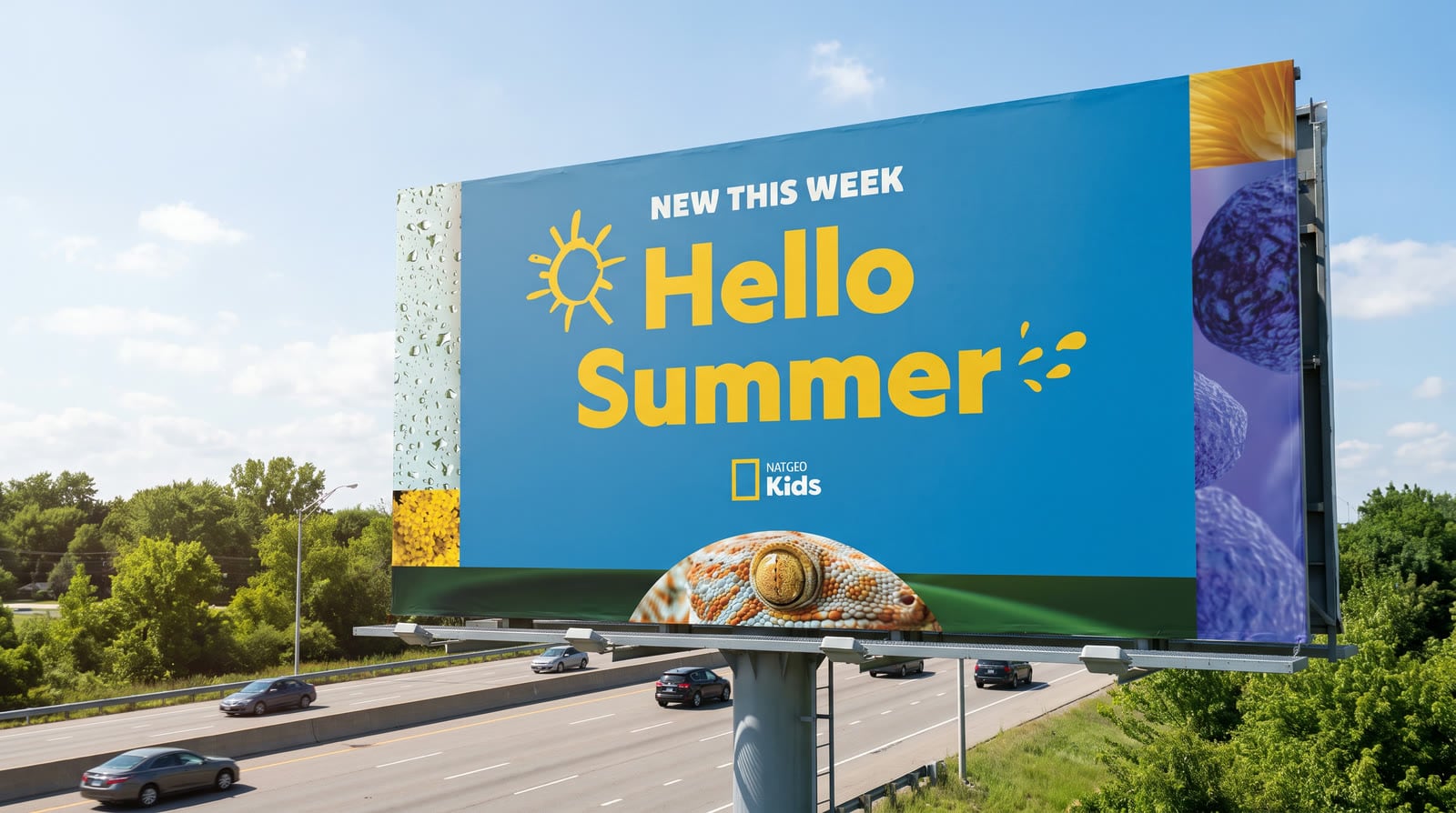
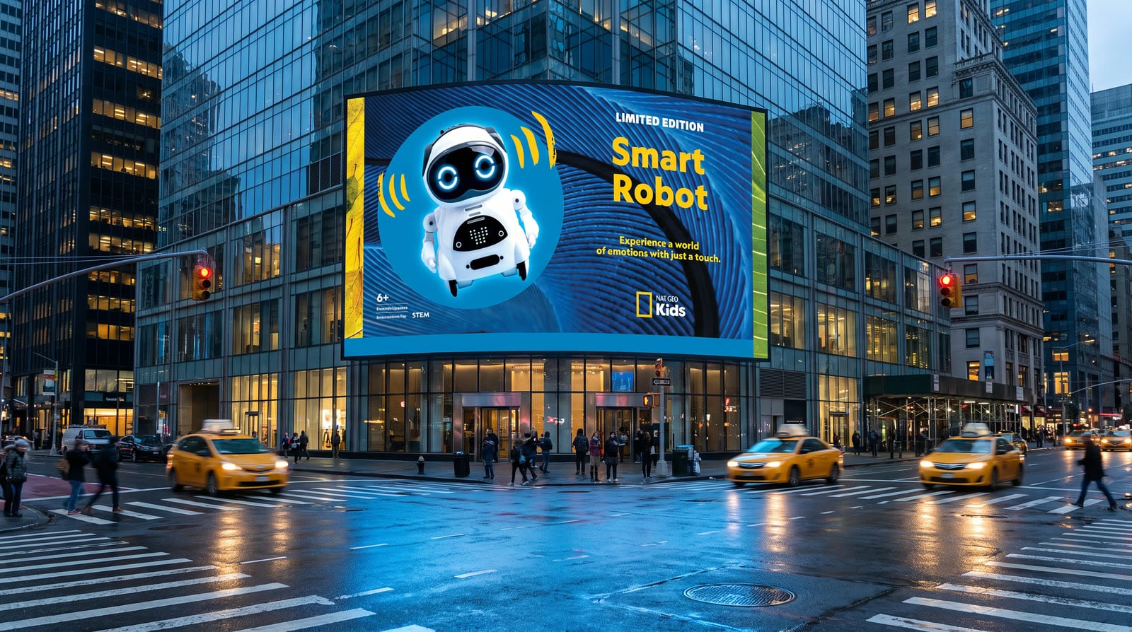
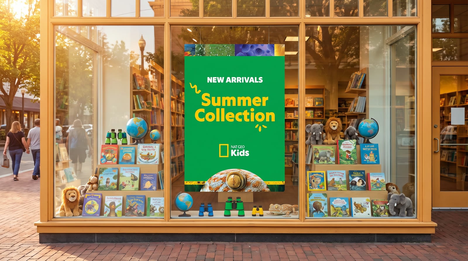
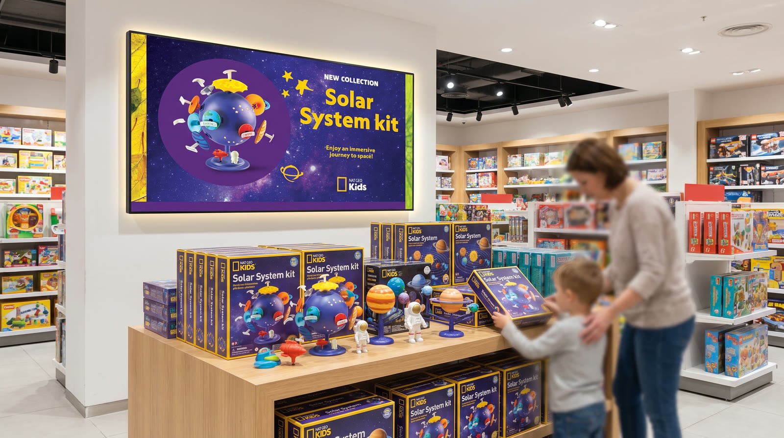
Off screen, the system extends to key art, out-of-home and in-store retail: billboards, digital screens, bus shelters, store windows and point-of-sale. Three generic layouts (Full Brand, Headline & Sublines, and Product) scale from 27x40 posters down to 16x9 and 4x5 digital displays, framing the brand color with arcs of photography and doodles that echo the curve of the globe.